Deals Dashbod | Project Notes
Interview Assignment | June 2015
Description
A small web development and improvement interview assignment for Deals Dashbod to demonstrate my skills and capabilities.
Live Project
Tools Used
- HTML, CSS, Bootstrap
- Javascript, JQuery, Angular JS
- MySQL (PHPMyAdmin)
Requirements
- A nonfunctional log in / sign up area
- An area displaying deals
- An area to attract users to use Deals Dashbod
- Create a MySQL database to store deal information
- Responsive Design
Process
Understanding
To better understand Deals Dashbod, I wanted to better Deals Dashbod and their users.
Deals Dashbod
Deals Dashbod is a daily deal tracker. It finds deals to help users save money and time. And deals are personalized for users for relevant use.
Users
Deals Dashbod is aimed at users who want to save money and time. Therefore, deals must provide great % savings. As for time, it seems like users are too busy to be keeping track of their deals. So deals must be time-sensitively tracked.
Design: A Dashbod Deal
An important thing to define is "what is a deal". Looking at the website, a deal must contain:
- Source (Groupon, Livingsocial, etc
- Link to it's source
- Title
- Venue
- Location
- Original price
- Deal saving price
- % off savings
- Image
- A deal must be sharable on social media
- A deal must be sortable and searchable
Technical
For quick developement, I have decided to utilize several frameworks and libraries such as Bootstrap for responsiveness, JQuery for easier user of JS, and Angular JS to handle data procesing and functionality.
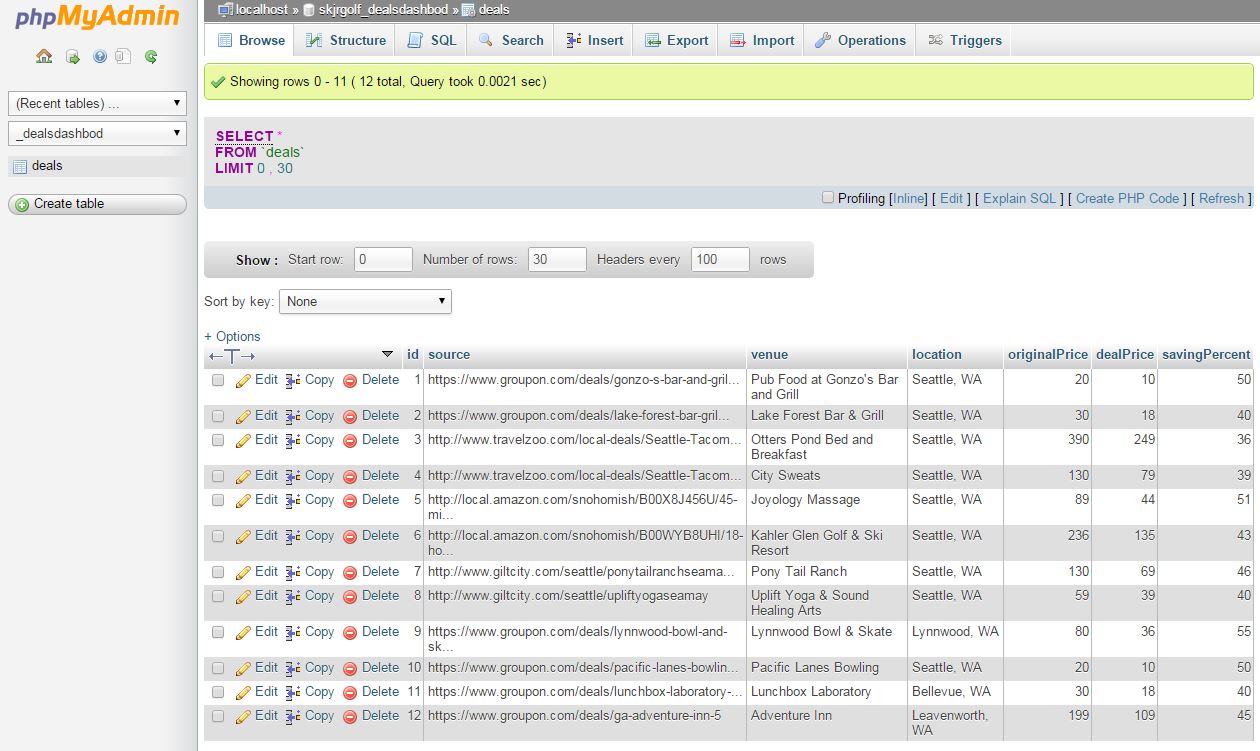
For storing the deal information, a MySQL database to be queries and return data to be processed. Note: I was able to create a database on my server, and populate it with entries. However, I was unsuccessful being able to access the database via php, and therefore was not able to run a query through that. Here is an image of the table I created along with it's simple query to retrieve it. So to compensate for that, the 'deal' information is currently stored as a JS object.
Improvements / Suggestions
Responsiveness
With my work, I tried to make the website more responsive. Responsiveness allows users to view Deals Dashbod on many screens, whether it be on the desktop or tablet or mobile. Also the current website utilizes the HTML TABLE tag for layout, which is not proper use.
Image Carousel
This is should be removed and replaced with something else that attracts users. Carousels kills the user experience. For further reasoning, see the links below:
- Should I use a Carousel
- Homepage Sliders: Bad For SEO, Bad For Usability
- Don't Use Automatic Image Sliders or Carousels, Ignore the Fad
Slow Loading Time
I noticed slow loading time is attributed to a security issue retrieving images. If you use Google Chrome developer tools, you can see the console messages about this.
Location Based Deals
On a future iteration of Deals Dashbod, especially on a mobile use, Deals Dashbod should display deals based on a user's location for impromptu use. I think this will promote further use of Deals Dashbod, and encourage users to use deals on the go. This will allow users to use deals without future planning.
Comparable Deals
Currently the only way to 'compare' deals is through the sorting and filering system. However, if a user wants to compare selective deals, they will still be opening multiple windows to compare.
"View Deal" button
If you want to interact with something, your mouse/finger will touch it. You should be able to select that deal with just a click/touch. Having the "View Deal" button is redundant.
Log In / Sign Up Area
There are multiple ways to log into Deals Dashbod (username, Facebook, and Twitter). This in a sense, is an information overload, especially on a landing page on the front page. It is one of the first things you see. There are too many options, and should be simplified. I moved the log in / sign up area to a seperate page.
More Deal Information
There needs to be a 'title' to a deal. The current 'title' is the venue, which doesn't give enough information for the user to know what the deal is exactly about. The user just knows where the deal is at. A single venue could provide several services and differnet deals. I'm not quite sure if you can extract this information from Dealers considering Deals Dashbod doesn't do it currently.
Adding Deals
Changed the way deals are 'added'. First off, in the original design the icon was misrepresented as a "+1 person", which is more like "let's add a friend". A clearer "add deal" button is used instead for more clearity. A long with a visual green update to show that it was 'added'.
Social Media Buttons
I opted to remove "share via ___". It is redundant to use an icon + text to show what the icon is suppose to be doing. If the icon needs text, then the icon doesn't represent it's purpose very well.
Price / Discount Sliders
The sliders provide too much selection for the user, and should be limited to 5% or 10% increments. It's a very rare care for someone to choose "I want something between 13% and 49%".
I also currently don't know how to implement a slider, which I think is still a better implmentation than my current input boxes due to ease of use.